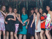
1. Our magazine follows many of the generic conventions and features of a magazine such as: we've used a three colour, colour scheme of blue,white and green which are teh colours of the schools logo,clear fonts that stand out using the colour scheme, A mide shot of the main picture which is students recieving their exam results,and other pictures explainging the text.
2. success: we used correct features of a magazine,different style fonts,mid shot images.
failures: we didnt include enough in the magazien to make it stand otu and overall it looked plain. it needed to be more busy and have more of the magazine features.
3. I've learnt that its really important to include as much as possible on teh front cover of amgazine so that it stands out, ive also learnt that its imoortant to edit picutres so that they look presentable on the page.
Subscribe to:
Post Comments (Atom)

No comments:
Post a Comment